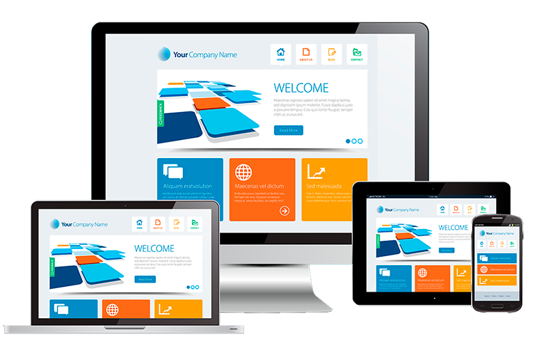
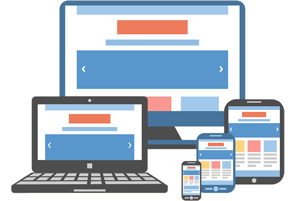
Responsive & Mobile Website Work
Benefits of Responsive design
- Everything is on the palm of your customers’ hands through our visually appealing and easy-to-navigate websites.
- Auto device detection and user is automatically routed to your mobile website.
- Mobile sites use simple, linear interfaces that have minimal left navigation. Content can be arrange in a single column layout, thus making navigation easier for mobile users.
- Micro Mobile site so that your sites load easily and do not consume excess phone memory.Easy navigation and simple architecture of your mobile web pages.Compatible with Nokia, iPhone, lackberry, HTC, Samsung, Micromax, LG, Motorola, etc.
- Auto detection and auto redirection feature. Single address for your mobile website so there is no need for m.domain
Cost, Time & Maintenance
Creating conventional website & then separate mobile website is costly affair. It’s time consuming and also extra effort in maintaining both the sites. The responsive website cost’s extra 25% but it worth going for it. In long term investing in responsive website design is the smartest decision.
The Future is Mobile
Very soon, mobile browsing will take over desktop browsing, the main reason mobiles are very handy. You can access any information on your figure-tips in few clicks. Most of the people use their mobile to read any article, news & do research related to products & services.
Higher Ranking in Mobile Search
Responsive design is an edge over conventional website when it comes to making your website both mobile and search engine friendly. By providing a single, dynamic version of your website to both desktop and mobile visitors, you make it easier for search engines
Customer Satisfaction
With us you get a website that looks clean, modern, sleek, and easy to ready. It creates customer satisfaction and builds trust and trust builds revenue.
Why Go Responsive with MaitKon
Over 70% of mobile device users expect sites to load as quickly on their cell phone as their computer or desktops. Therefore, we are providing amazing Responsive Web Designing Services through our dedicated designers and developers that can create a responsive web design for your business.
Our services make you sure that your site looks clean and smooth on every mobile device with any screen size, and provides the outstanding possible chances of retaining your online customers and visitors. With a responsive web site, you can make your business accessible to people all the time. Our services mainly focused on these aspects:
- Touch-friendly navigation options
- Simplified design layouts as well as text to provide users a pleasant mobile browsing experience
- Wide range of compatibility of all mobile web browsers such as iPhone, Android, iPad and windows Phone
- Optimization of graphic images that make sure the fast and quick your site web pages loading that will not turn your potential customers away.
- Fluid Design which will auto adjusted with any kind of screen resolution
- We offer a number of web design services to grow your online presence as well as target mobile audience. If you want to learn or know more about designing a mobile-friendly website for your business, contact us, we will be happy to help you.